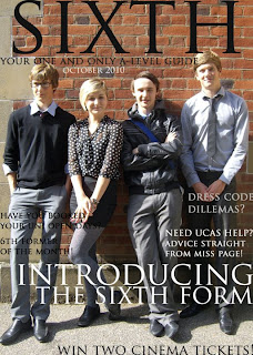
Whilst working on my preliminary front cover, I encountered several problems regarding the general aesthetics of the school magazine. Firstly, the image of the students posed some problems for deciding font colour. On the left hand-side, the model’s grey trousers and black skirt did not work well in sync with each other and it was difficult to find a colour that contrast to both grey and black and stood out. I settled with black font of the cover lines and positioned them in the most suitable place where they could stand out. However, they do not stand out enough to show they are easily visible to a reader.
The positioning of the main cover line also proved difficult as it had to be big enough to cover the large amount of the image left along the bottom of the front cover. I overcame this issue by widening the spacing in between the two sentences of the cover line so they took up more space of the models shoes. If I hadn’t of done this, the model’s shoes would have stood out and would’ve looked odd.
I had previously positioned the puff along the bottom of the page, however it didn’t really stand out enough and it would be easily missed by the reader. I decided to enlarge the text and centre align it more on the page. I also included a picture of a cartoon cinema ticket to break up the main image and emphasise that there are more interesting articles in the magazine.
I decided to move the dateline because underneath the masthead, it could easily be missed by the reader. I decided to align it vertically against the right-hand side of the front cover. I also changed the colour of the dateline in order for it to stand out more against the brick background.
The decision to alter the selling line came after I was advised that it could be too obvious for the reader because it was so close to the masthead and a somewhat large font. I decided to change the positioning so it was under the masthead and somewhat less obvious. This is because the purpose of a selling line is to catch the reader’s eye rather than the reader not being able to miss it.
First draft Final draft
First draft Final draft
I made several changes to my preliminary contents page as I experienced several problems with the formatting of the font, colour and positioning. The main image was generally perfect for my contents page because it gave a lot of space to work with regarding text. The neutral clothing of the models worked very well in my favour regarding the colours that I could use as the neutrality meant that I had a wide range of colours to choose from. However, I decided to incorporate the blue of the jacket into the colour of the page numbers and the quote.
I decided to include the magazine title on the contents page to cement the link between the two pages to ensure that it is obvious that they are part of the same magazine. The decision to include the quote happened because I felt it would add depth to the magazine and move away from a cliche school magazine and also the idea of teenagers that people uphold that we take our education for granted, because I know that it largely, untrue.
I had some problems with positioning the 'On The Cover' text and the 'Introducing the sixth form' article title because it would overlap on the model's head and because the text is dark, it would be difficult to read.


