Evaluation of first draft: front cover, contents page and double page spread
Front cover
This is the first draft of my music magazine front cover. I chose my house colours as red/pink, white and black. I wanted to keep the style simple and not too busy as I felt it would take away from the main image of my new band.
As my first draft, I found lots of problems with this regarding the colours, font choice and positioning. The first problem was that the masthead ‘Airplay’ would cover the model’s hair and looked odd. The font for the cover lines did not suit the whole layout and was too big even when I reduced the size. I also decided that there weren’t enough cover lines on the page so I decided to add more in my final draft. The main cover line ‘Get ready for…’ obstructed the main image quite a bit and it made it difficult to see it with the patterned tights. The main cover line ‘The Vivid’ did not stand out enough against the main image and other pieces of text.
All of these problems have been resolved in my final draft of my front cover.
Contents page
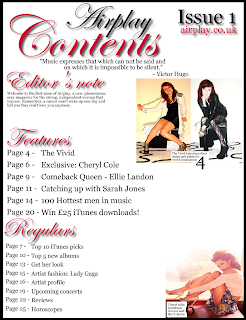
On my contents page first draft, I used the same house colours. My ‘editor’s note’ looks too small on the page and will need resizing. There are not enough items in the ‘features’ and ‘regulars’ which makes it look like a school magazine. I need to make the ‘issue 1’ smaller as it’s too big for its purpose and should only be small in the corner of the page. The font size is both irregular for the ‘features’ and ‘regulars’. There needs to be more images to visualise the articles more to the reader. I also need to get rid of the Cheryl Cole image as there was some confusion about the use of secondary images within my classes but it was clarified that we couldn’t use secondary images after we checked the specification.
Double page spread
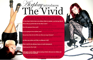
I was overall quite happy with the double page spread apart from a few minor details. These were the colour of the block where the interview was. I felt that even though I was keeping in line with the house colours, the red/pink was far too garish for that size and with black and white text behind it; it made it difficult to read. I also wanted to change the headings ‘Airplay’ ‘introduces’ and ‘the Vivid’ because they didn’t stand out enough.


